Getting nine brands ready for the law
The European Accessibility Act was coming into force and our business unit websites were not going to meet it. Non compliance meant fines that would land on the wider business. I designed and built a public resource to make the scale of the change clear, and ran the internal campaign alongside it. Four weeks, start to live.
Project summary
The problem
A fixed legal deadline, and a gap between where our sites were and where the law required them to be that was far larger than anyone had assumed. Missing it meant financial penalties across the group.
The solution
A public resource covering audible, physical, visual and cognitive accessibility, each written as a learning path rather than a list of rules, backed by a monthly internal campaign built to the standards it was preaching.
The results
- Built and live in 4 weeks
- Business units compliant in time
- Penalties avoided across the group
- Passes accessibility testing itself
01 - Where it started
A legal deadline, and nine brands to bring along
The Act itself wasn't a surprise. We had already been thinking about accessibility in our banner work, so the principles were familiar. What we hadn't done was check our own business unit sites against the requirements properly, and once we did, it was clear how much there was to get through.
The harder part wasn't technical. Stakeholders across nine brands needed to understand what the Act meant, why it applied to them and what it would take, and they needed to understand it quickly. A written document was never going to manage that on its own.
02 - The build
A learning path, not a list of rules
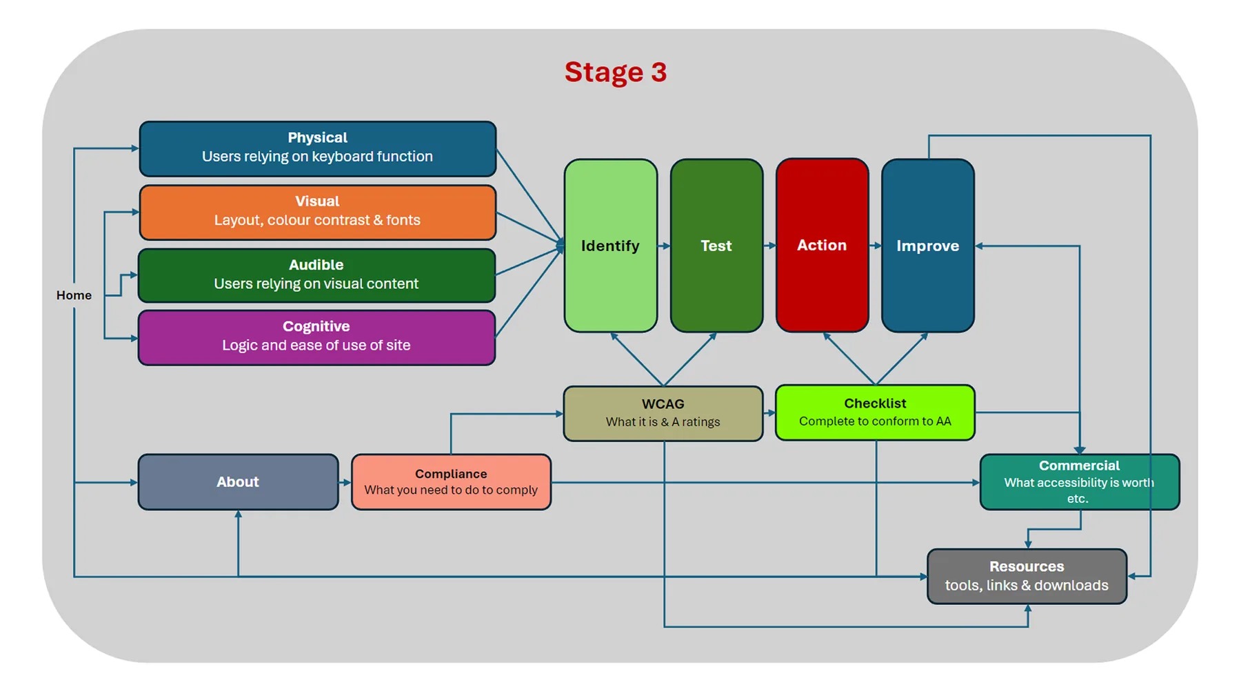
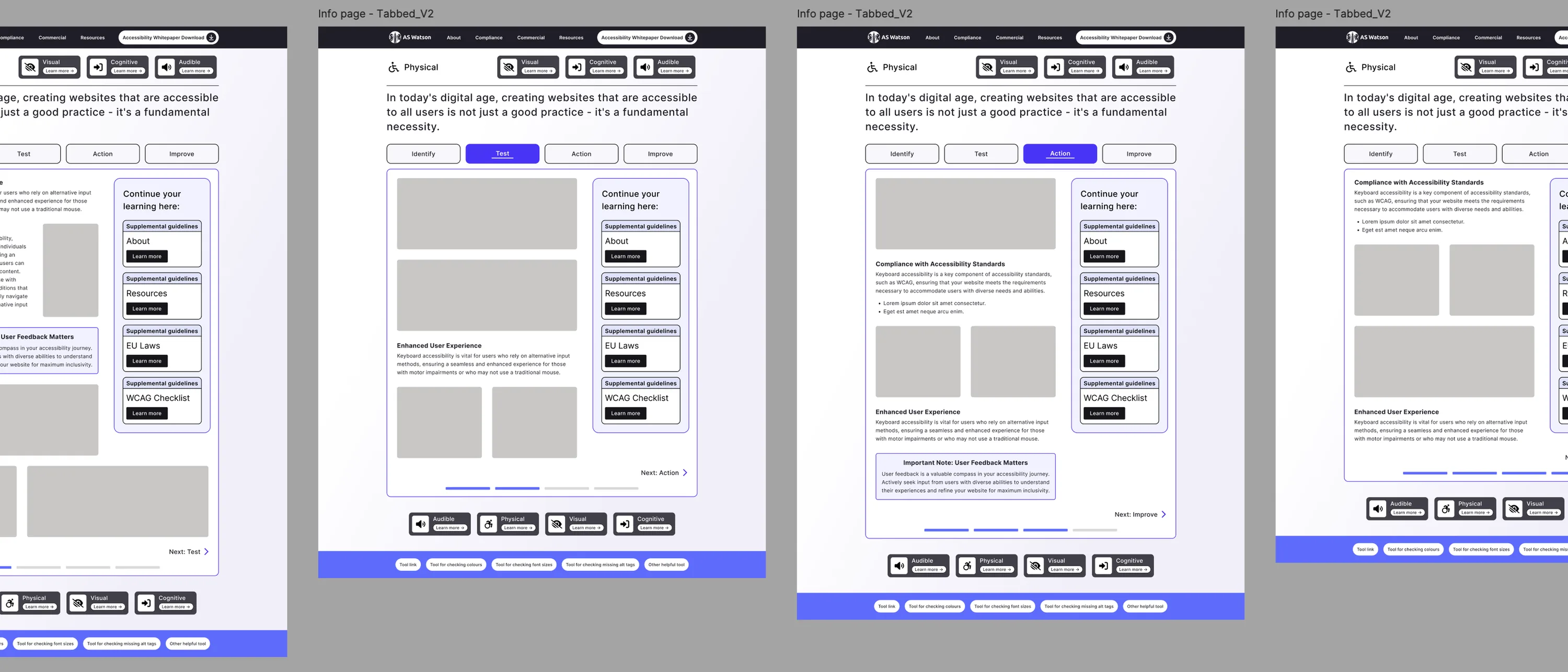
I designed and built it around the four areas people actually experience: audible, physical, visual and cognitive. Each one moves through identify, test, action and improve, so someone arriving under deadline pressure gets a route rather than a wall of requirements. Every section carries a time to read estimate, because the people who most needed this had the least time to give to it.
Show it rather than describe it
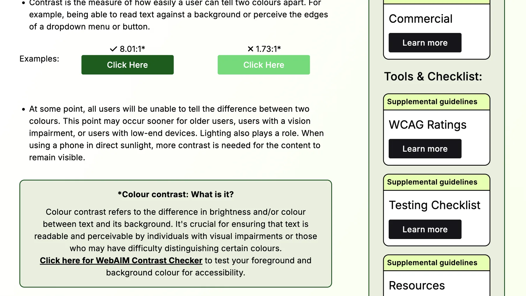
Where something could be demonstrated, it is. Contrast gets a passing and a failing button next to each other with the ratio above each one, so you can see the difference rather than read about it. Colour blindness is simulated on the page instead of explained. For a resource about visual accessibility, that seemed like the right way round.
Each section also ends with dos and don'ts, because a stakeholder skimming under time pressure will read those even if they read nothing else.
03 - The detail
Faking a designed email in Outlook, on purpose
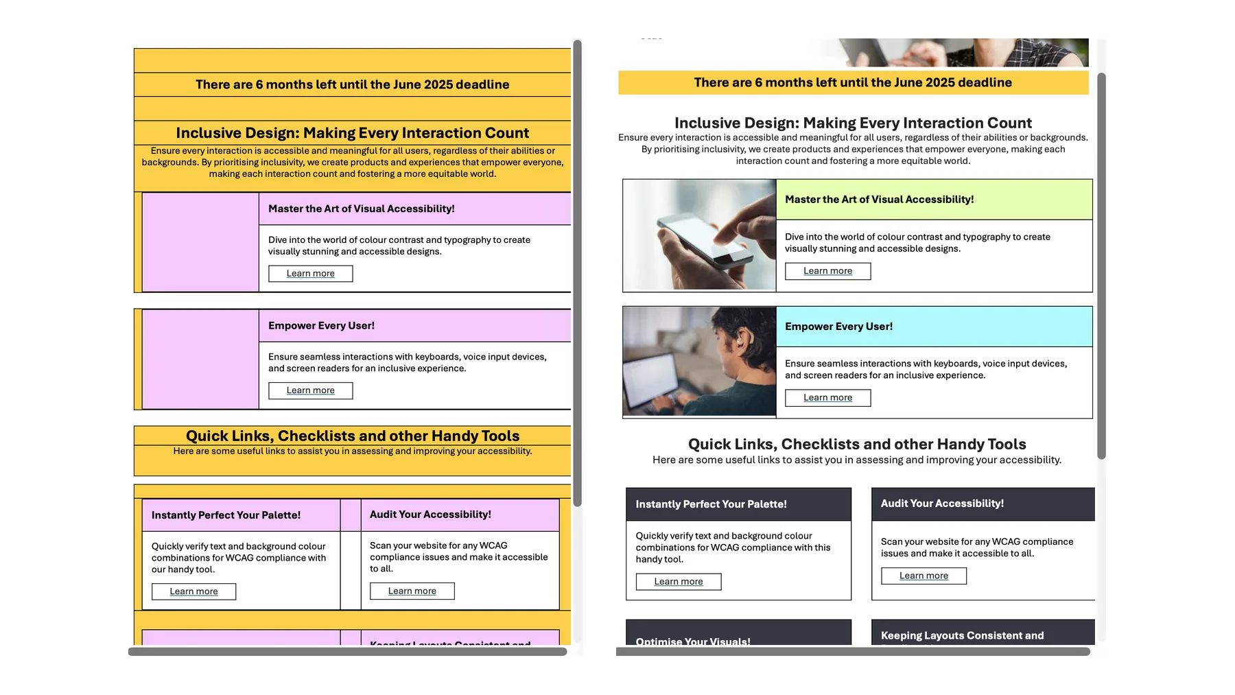
The site was one half of it. The other was a monthly internal campaign, and internal meant Outlook. The convention was to design a newsletter elsewhere, export it as an image, and send that. For a campaign about accessibility, that was indefensible. An image has no text for a screen reader, cannot be resized, and fails on contrast the moment someone changes their settings. So I spent some time working out how far Outlook's own tables could be pushed. I started from one as a baseline and edited and manipulated it from there, shaping it until it matched the site. Everything in it stayed real, readable, resizable text.
04 - The outcome
It moved people, which was the whole point
The site became the reference. It ran through internal comms, it was used repeatedly in training, and it was the thing pointed at when a business unit needed to understand why a change was not optional. The brands acted, and they were compliant in time. Without the site and the campaign around it, business critical deadlines may not have been met. It passes accessibility testing itself, which mattered, because the first thing anyone does with a site about accessibility is test it.