Optimisation and A/B testing
I've designed over 200 A/B tests since 2024 and coded more than 120 of them. Most of that time I've been working with one business unit at a time, mainly Savers and more recently ICI Paris XL, supporting colleagues on the others when they've needed it. What carries over between them isn't the tests themselves, it's the way of working out what's worth testing in the first place.
Project summary
The problem
There's never a shortage of opinions about what will improve conversion. Very few of them come with evidence, and some come from people senior enough that disagreeing politely needs proof rather than instinct.
The solution
A repeatable practice. Structured discovery from analytics, heatmaps, customer comments and full Baymard based site assessments, PIE scoring to anchor prioritisation, and enough discipline to hold when a result is inconvenient.
The results
- 200+ tests designed since 2024
- 120+ tests coded and shipped
- €125k incremental revenue in 2026 so far
- Across PDP, PLP, cart and checkout
01 - Discovery
Where the ideas actually come from
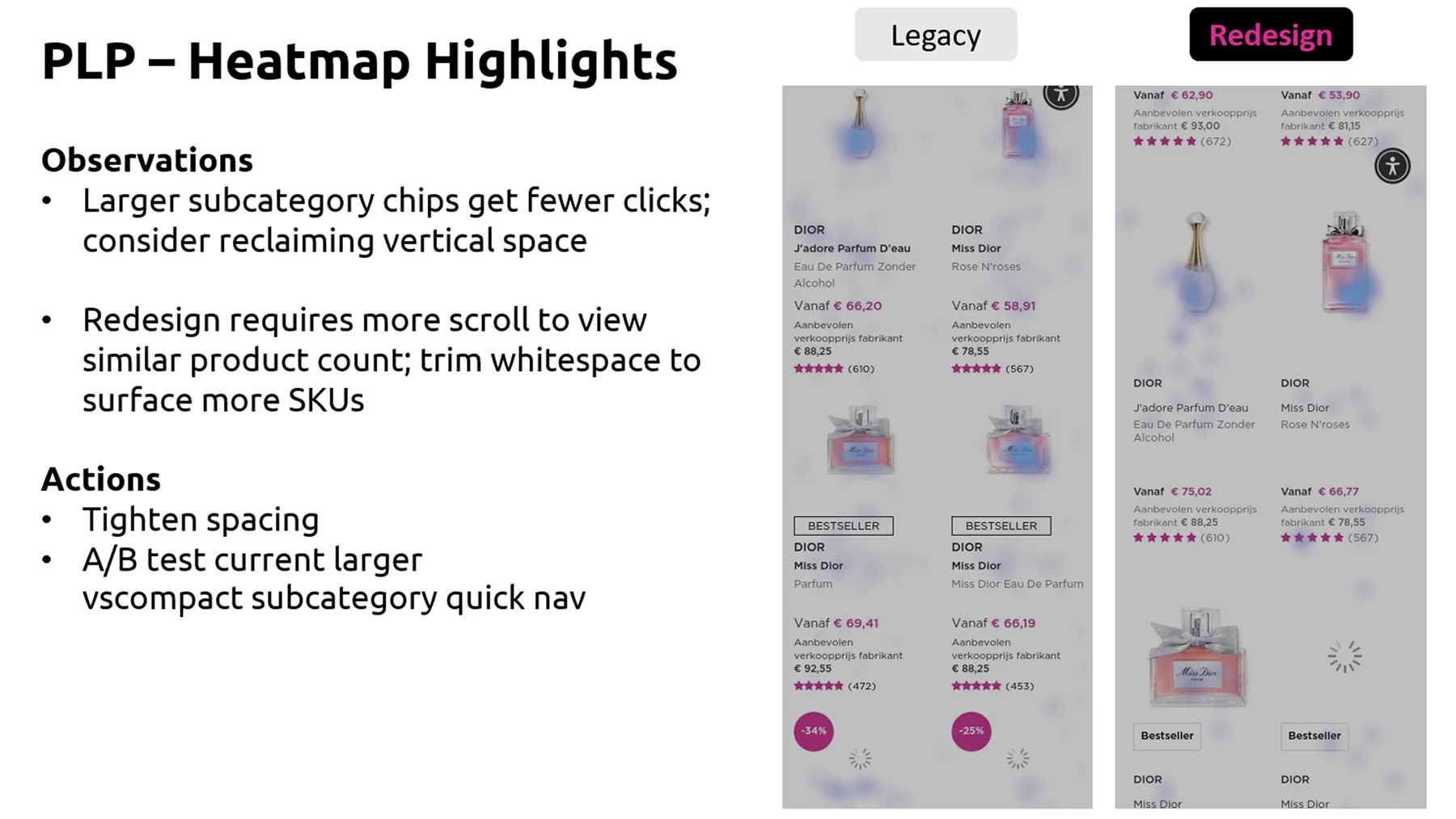
Heatmaps, traffic and performance data, recurring themes in customer comments, and a lot of simply using the sites and noticing when something feels wrong. The most structured version is a full digital assessment against Baymard, working from the homepage through to the final step of checkout, across desktop, mobile and app. That produces a findings presentation for the business unit, and every finding then goes one of three ways. It gets tested, it gets implemented directly, or the business unit decides against it and it gets parked.
02 - Prioritisation
PIE scoring, and then reality
PIE (Potential, Importance, Ease) gives us a score, and that's the starting point for what runs next. It's rarely the whole answer though. A site release, a campaign or a commercial priority will shuffle things around, and what usually happens is the score gets weighed against what the business unit actually needs that month.
Working across several brands sounds like it should create a queue, but it doesn't. Each brand has its own site, so a test running on one has no bearing on another. It's a question of scheduling my time rather than anything competing. I take one business unit at a time and give it my full attention.
03 - The code
From building tests to designing them
I trained as a graphic designer. When a developer left, I stepped up to cover the test builds alongside my own design work, learned JavaScript on the job, and ended up coding more than 120 tests. The running joke was that there were two versions of me, UX Adam and Dev Adam.
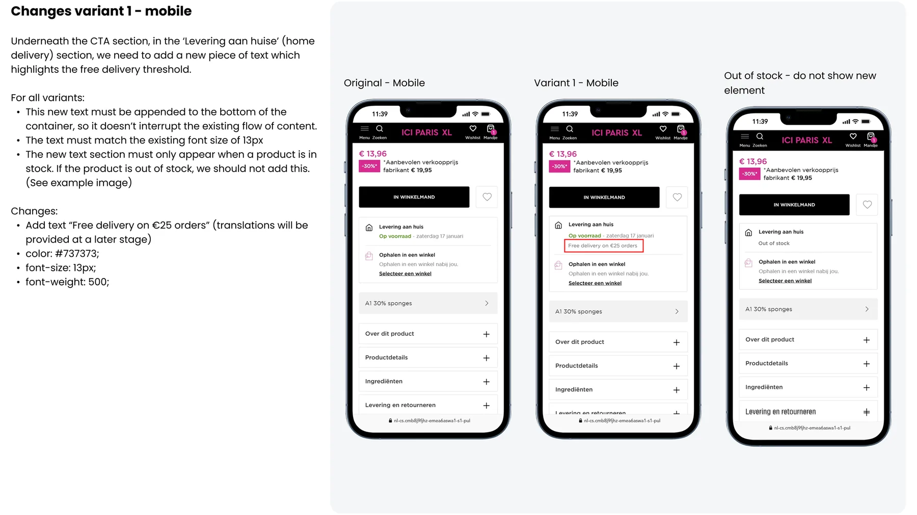
The tricky part was rarely the variant itself. Our sites are single page applications, so the code has to know when to run and when to stop as someone moves around without the page ever reloading. That took a while to get right.
I don't build the tests any more, and that's a choice rather than a skill I've lost. What those years left behind is more useful than the coding was. I can tell whether an idea is realistically buildable before it reaches a developer, and I'll write the CSS straight into a brief while leaving the JavaScript to the people whose job it is now.
04 - Being wrong
The test that won everywhere except where it mattered
The useful failures were not the ones that lost. They were the ones that won somewhere and then lost somewhere else. A change that performed strongly on one brand would go negative when we ran it on another, and the pattern was audience. Mass market and luxury customers do not respond the same way, and neither do different European markets. That mattered beyond the tests themselves, because senior stakeholders saw a winning result and reasonably asked why we would not simply roll it out everywhere. Having the evidence meant we could make the case for testing per brand rather than assuming a win transfers. That's a much easier conversation to have with data than with an opinion.
05 - Two examples
Free samples that people were missing
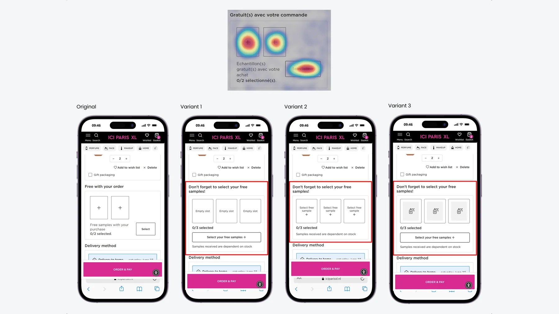
On ICI Paris XL, customers get free samples with their order, and they have to pick them. Contentsquare showed almost everyone struggling with that step, consistently, on both desktop and mobile. People either didn't realise they had to choose, or couldn't work out how.
There was a second problem underneath it. Samples are stock dependent, so someone can pick one and not receive it, which turns a nice gesture into a complaint.
My read was that this was a tone and clarity problem rather than a layout one. Warm up the wording, make the action you have to take obvious, be honest about stock upfront, and treat it as a free gift rather than another form field. If people engage with the step more easily, conversion should follow.
A one pound offer that was hard to find
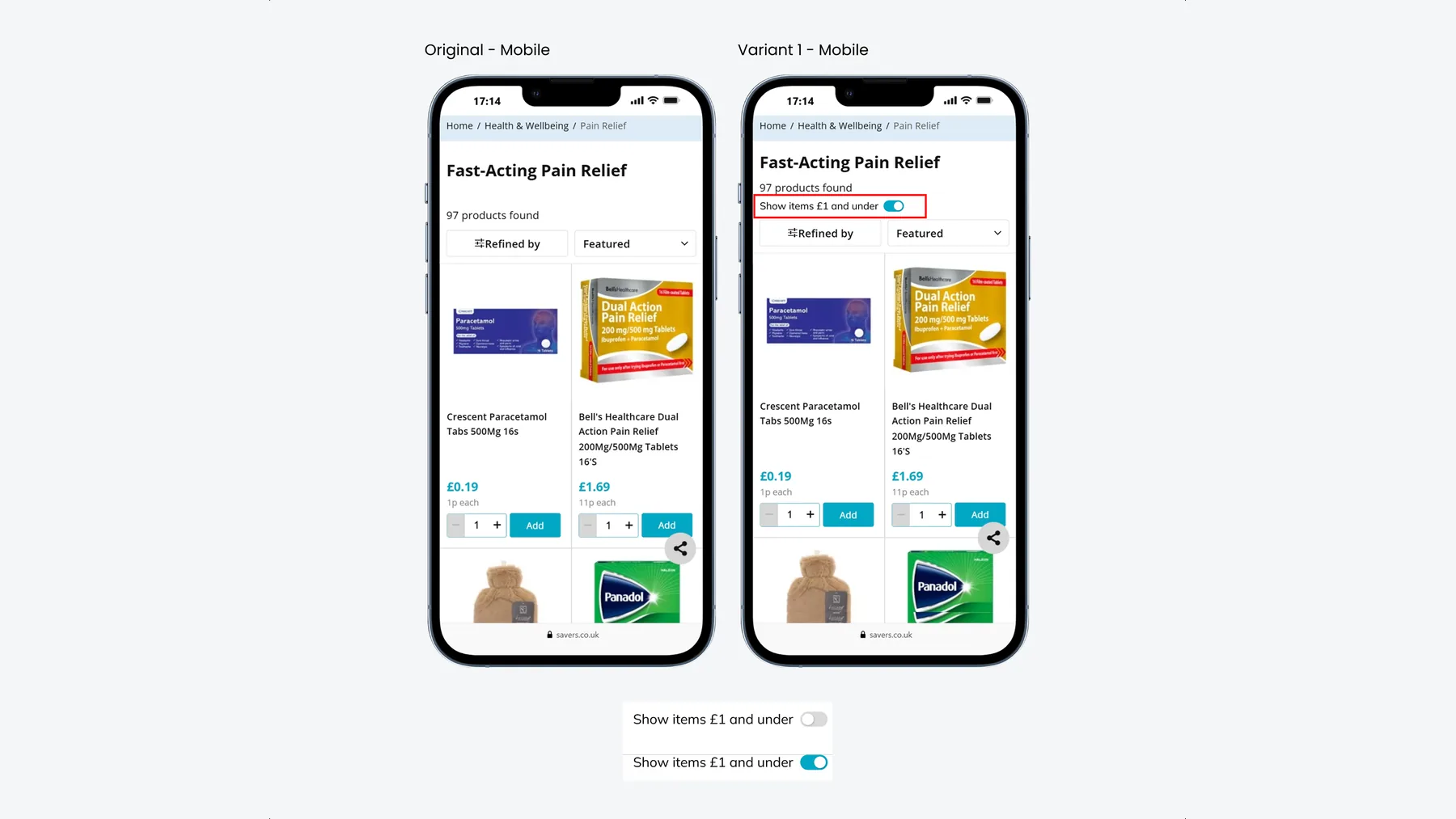
Savers run a £1 and under range, which is a good reason to add another item to your basket. The problem was that it lived on the homepage and then more or less disappeared. Once you were browsing a category, there was no easy way back to it.
The idea was a toggle on the listing page, so switching to £1 and under takes one tap. Underneath it doesn't need any new filtering logic, it applies the price filter that already exists and hits apply. Easier to find should mean more items added, and a higher basket value.
The brief went to the developers with the toggle states and styling already specified, and it carried the edge case, which is usually the part that gets missed. Some categories already have a minimum price above £1, so the toggle would return an empty list. On those pages it simply shouldn't run.