ICI Paris XL
ICI Paris XL were behind schedule on a full website redesign, with a team member recently gone and a development window already booked in. There were about three weeks left. I took on the product listing and detail pages, several input forms and part of checkout, and got them into a state the developers could build from. It shipped on time.
Project summary
The problem
Existing designs were outdated, not responsive, and not componentised. Whole pages had not been started and the edge cases were missing. The development slot was already committed, so missing it meant the whole thing being pushed.
The solution
Extra design capacity that could work inside someone else's system without slowing them down. Components rebuilt, responsive and hover states defined, edge cases drawn, documented well enough to hand over cleanly.
The results
- Deadline met, live since January 2026
- Working with the team a year on
- Now running their experimentation programme
- And their annual digital assessment
01 - The call
Three weeks, and a booked development window
ICI asked us for help because they weren't going to make it. A small team had lost a member, the scope was an entire website redesign, and the development slot was already committed in a roadmap. Missing it wouldn't have meant a short delay, it would have meant the whole thing being pushed. I was asked to help because the turnaround was tight, and because I'd worked on the Trekpleister design system previously, where everything had to be pixel accurate, properly structured with auto layout and faithful to a brand that already existed. That experience turned out to be useful here.
02 - The work
Designing inside someone else's system
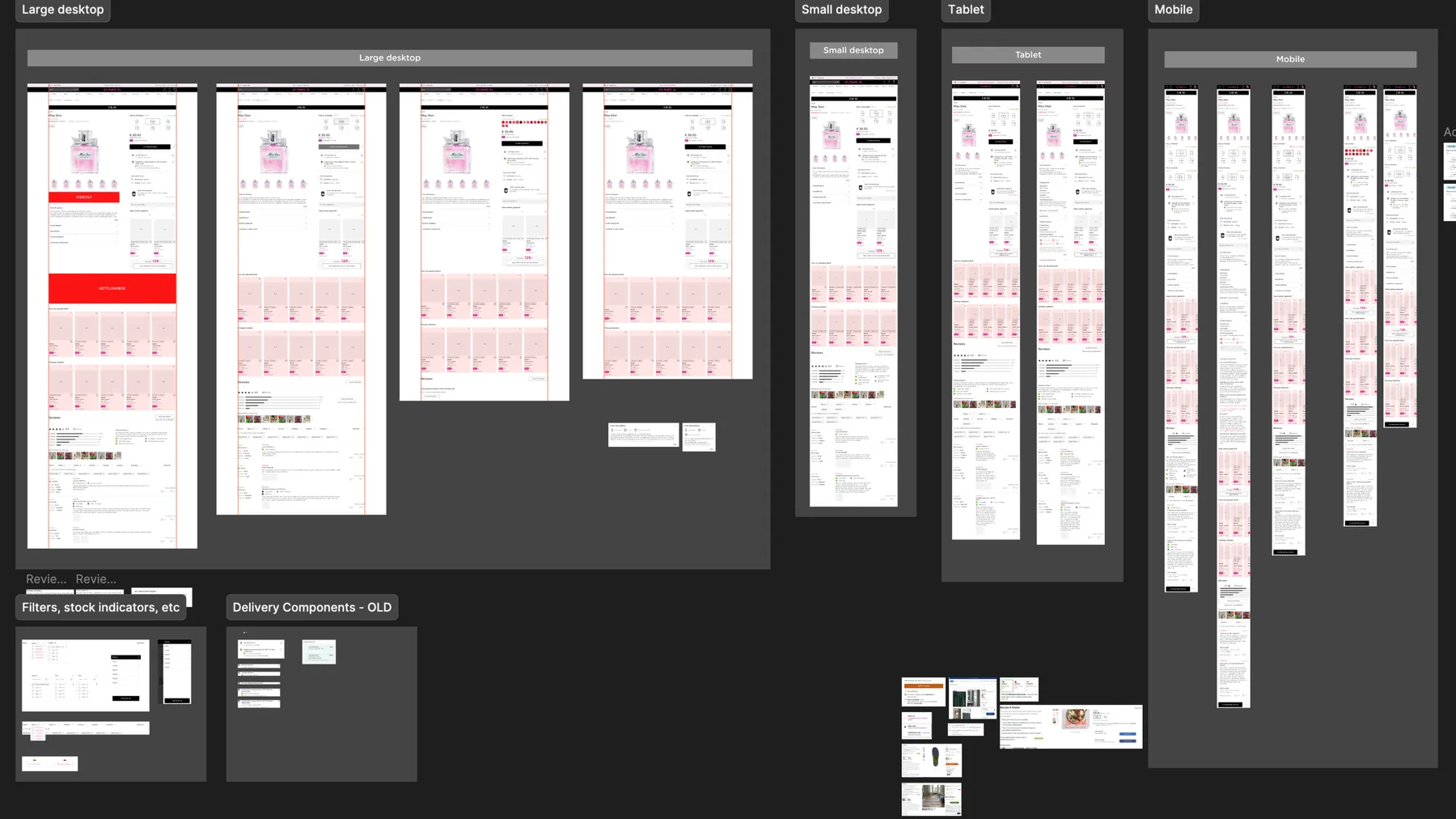
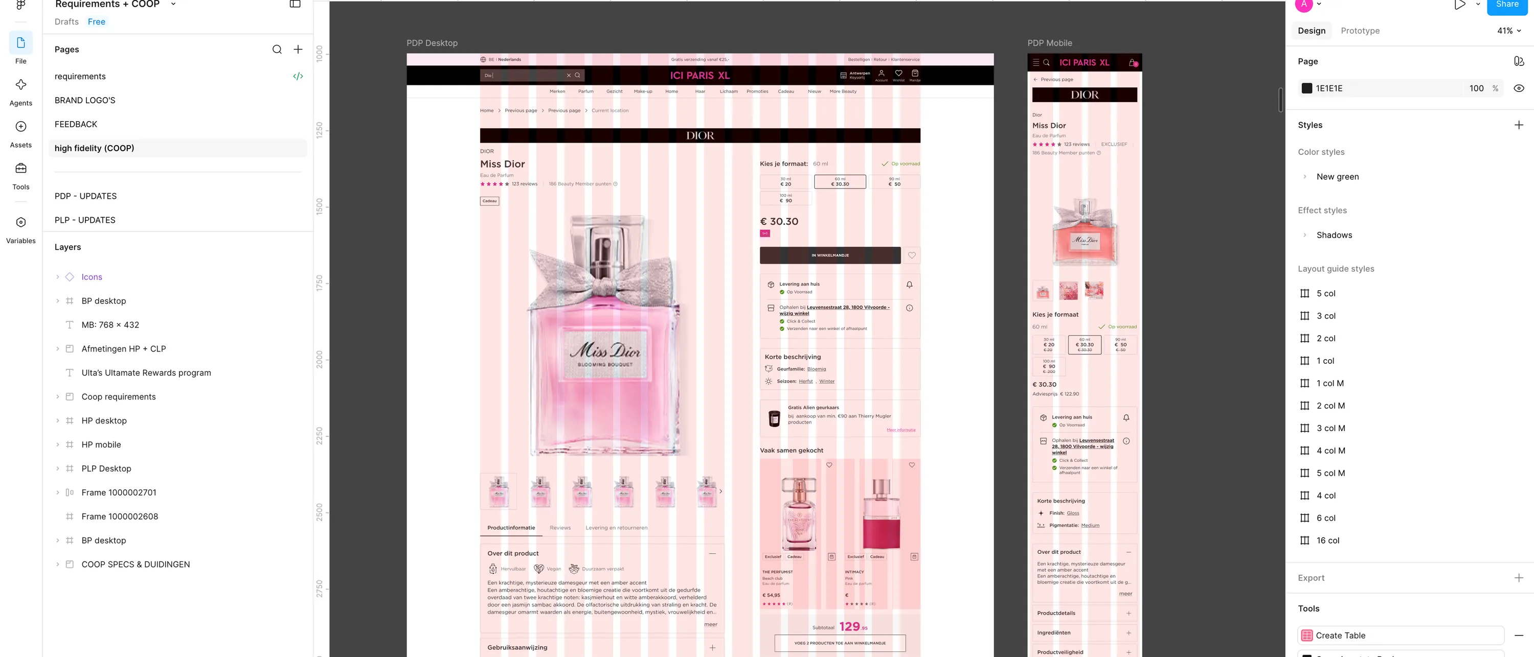
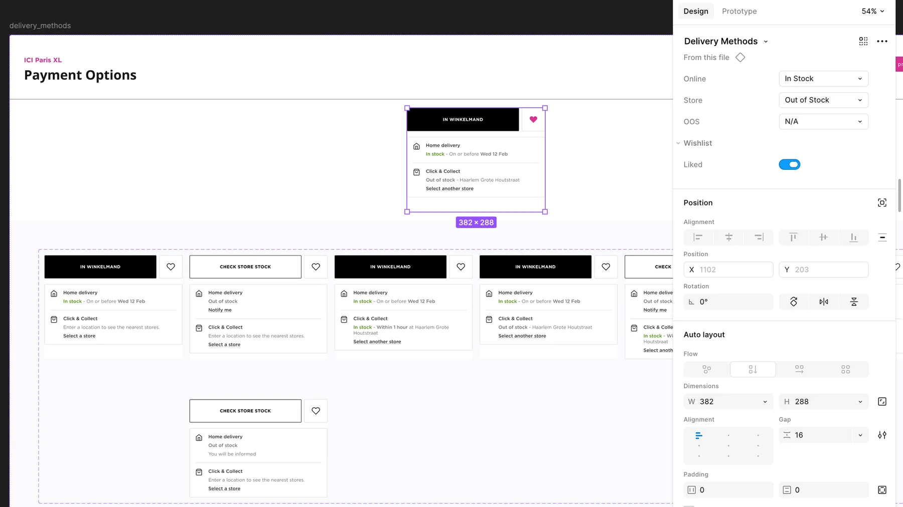
I took the product listing pages, the product detail pages, several input forms and part of checkout. Getting to dev ready meant components rather than flat screens, responsive and hover states, edge cases, and enough documentation for developers to build without coming back with questions. Some of what I needed didn't exist yet, so I built it by reading the rest of the system closely and working out the rules from what was already there, matching spacing, padding, type and colour so the new pieces sat alongside the existing ones without standing out.
03 - The friction
Outdated components, and a language I do not read
Two things made it harder than the timeline suggested. The existing components weren't just unfamiliar, they were outdated, and nothing documented how they should be reworked. So alongside producing new designs we were repairing old ones and deciding as we went what the right version should be. The second was language. The work was in Dutch, and designing hierarchy relies on being able to read the words. When you can't, the instinct for what should be emphasised goes missing. It meant a lot of back and forth with a translation tool, and being much more deliberate about hierarchy than I'd normally need to be.
04 - After
The part that actually mattered
They hit the deadline and the redesign went live in January 2026. The team said they could not have done it without us, and asked us to stay. That is the part worth paying attention to, because an internal agency lives or dies on whether a business unit comes back. What kept it going wasn't really the design work. It was being around consistently rather than being a team that finishes a project and disappears. Weekly calls, a Teams chat we use daily, and a habit of spending the first five minutes asking about someone's weekend rather than the backlog. That sounds trivial but it's not. It's the difference between being a supplier and being someone they actually trust.
05 - Now
Where the next round of work comes from
Once a year I run a full digital assessment against Baymard's research criteria, from the homepage through to the last step of checkout, across desktop, mobile and app. It benchmarks ICI against five competitors including Amazon, Douglas, Notino, Nocibé and Sephora, with a score, so the team can see where they actually sit rather than where they think they do. Findings are prioritised by impact and effort, favouring quick wins and anything that moves a commercial metric. Everything testable becomes an experiment. The rest goes into the development roadmap, including a three month push to properly build the winning tests that are currently running as temporary implementations.